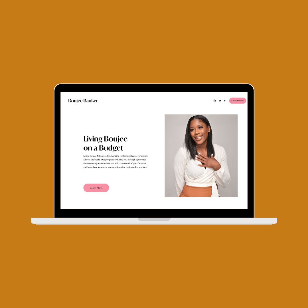
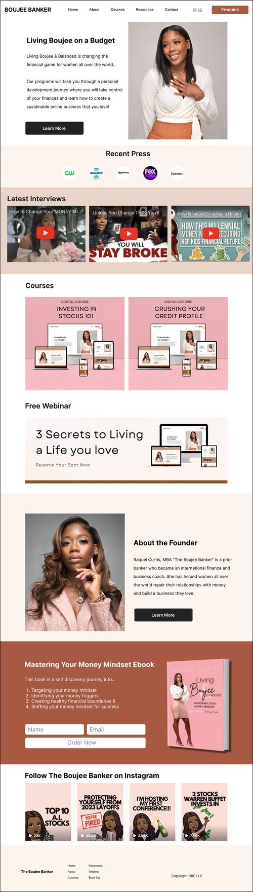
The Project
The goal for this redesign was to provide a better user experience for website visitors who are interested in purchasing an ebook, course or enrolling in a free webinar.
We also wanted to modernize the website, making it more vibrant, feminine and aligned with the boss babe aesthetic!
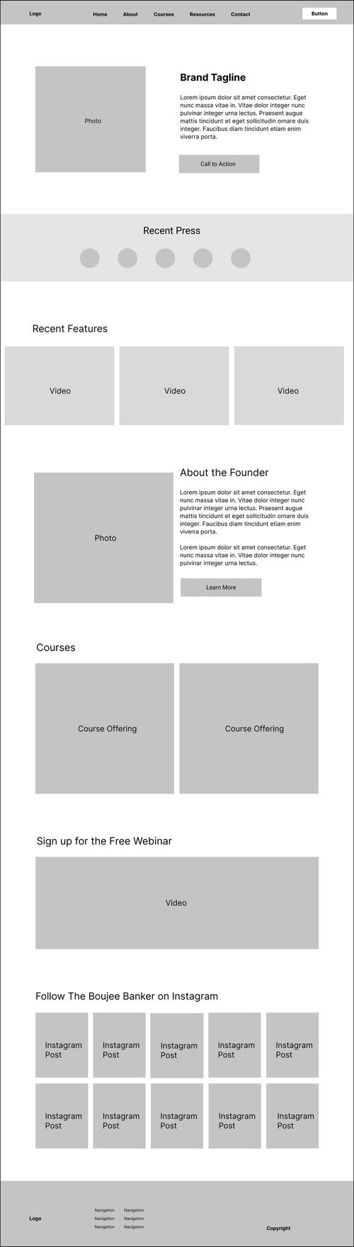
View Mockup Site
Website Audit
Home Page
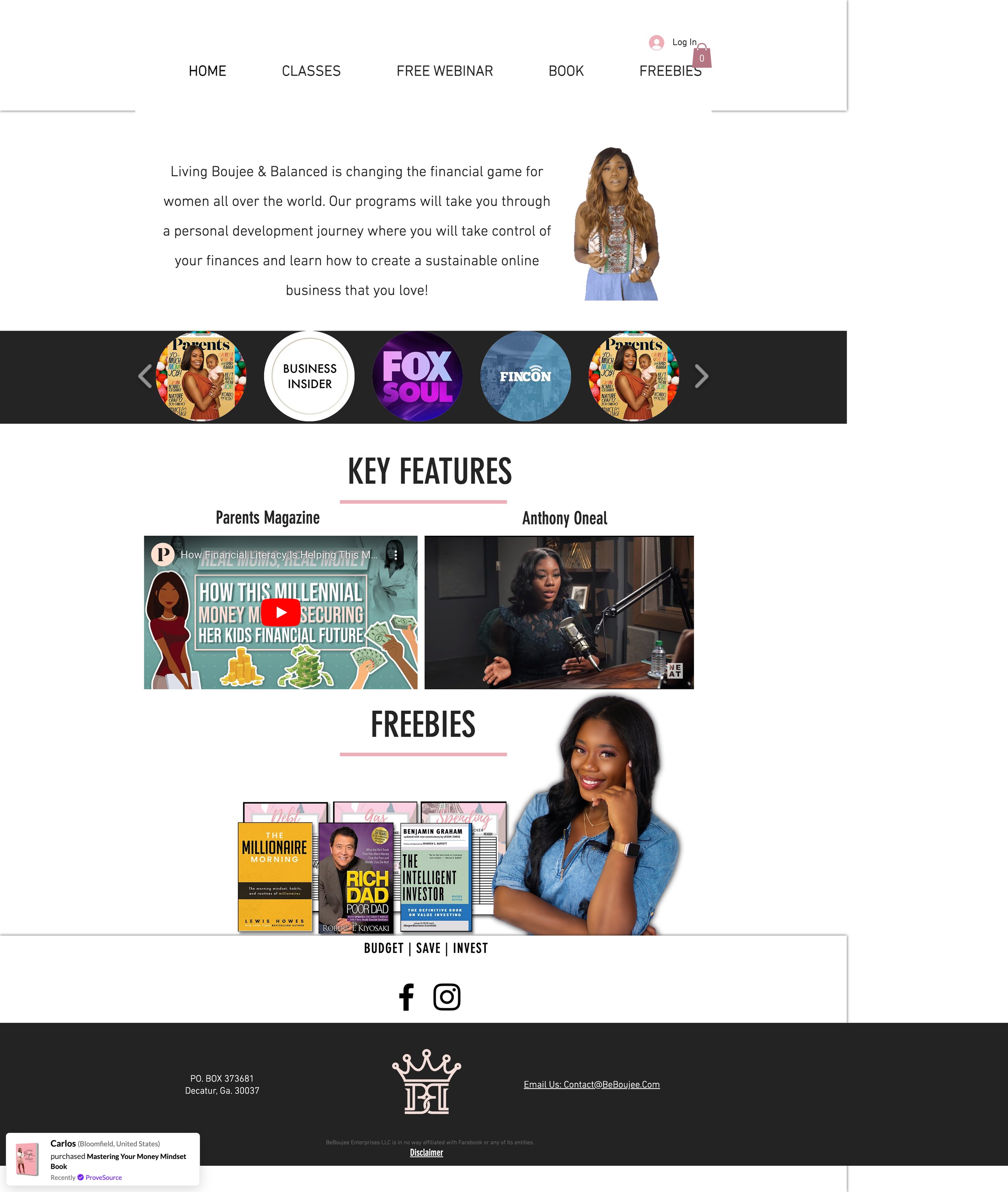
- The logo and brand name are nowhere to be found on the home page. This is typically located in the upper left corner of every website.
- The visual design of the homepage is not reflective of the bold pink color found throughout her instagram page — it looks very drab and outdated.
- The website uses too much white space, and does not have proper spacing or hierarchy.
- There are no calls to action and it is hard to determine what is the most important information.
Accessibility Issues
- Highlighting the navigation menu items hover state is pink on white is poor for accessibility.
- The best thing to do would be to make this a darker pink color like a magenta.
- Navigating to book page — the header menu no longer exists so you can't navigate to previous or other pages / once you add to cart and VIEW cart the menu appears again.
Customer Journey
- There is a chance the business is losing potential customers. When I navigated to the book page, customers are unable to return back to the home page or navigate other pages because the navigation menu is missing.
- The Industry standard terminology for online learning is "courses" rather than classes so I would update the language used here to follow users mental model.
- Free Webinar link — I would recommend calling out the value proposition or at least the title of the webinar. There is no information on the home page regarding the webinar which is a missed opportunity.
Broken Links or Images
- Carousel of features is repeating on the 4th image and logos are not consistent.
- The logo slider area is too busy and distracting. For visual consistency, it would be better to use similar logos.
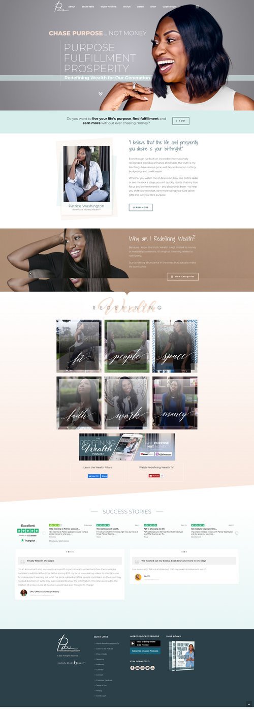
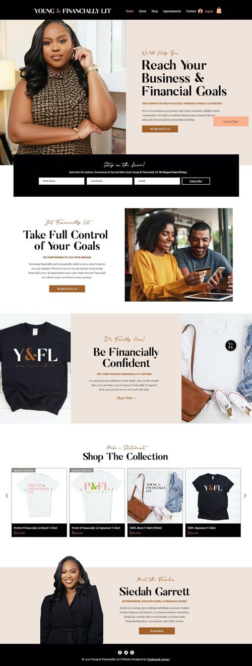
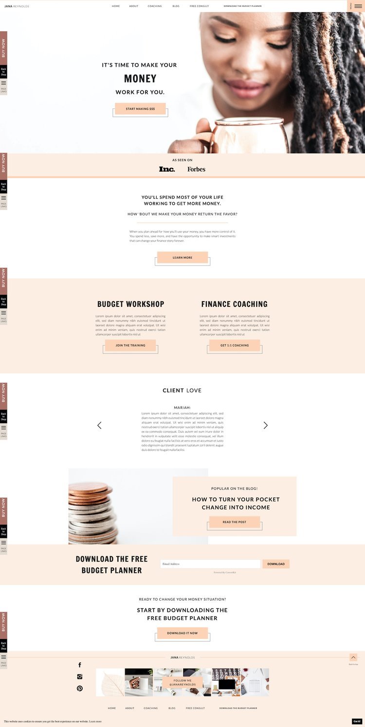
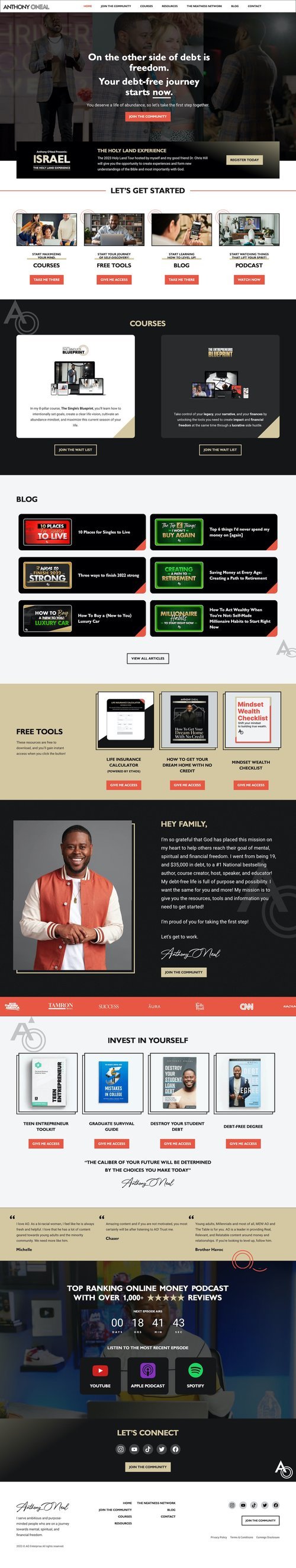
Competitive Analysis
To get a better understanding of industry standards for financial coaches and help inform my design, I conducted a competitive search. I was familiar with Anthony O'Neal and Patrice Washington. I also found a ShowIt template targeted towards finance coaches.
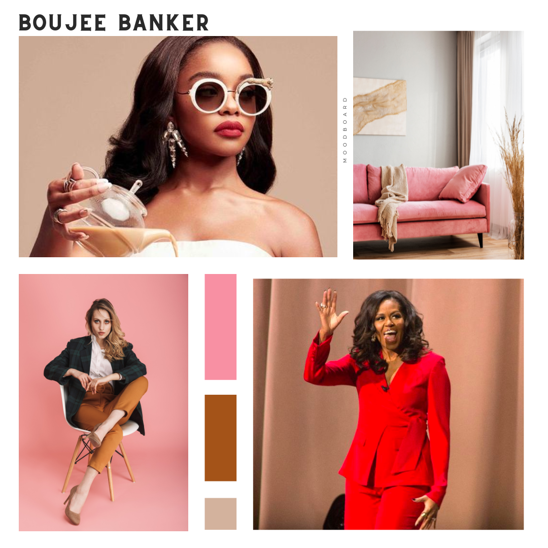
Moodboard
I gathered inspiration from the current brand and target audience which are largely women who want to live a specific lifestyle but still manage their finances wisely.